


We know that a positive relationship between two variables can be shown with an upward-sloping curve in a graph. A negative or inverse relationship can be shown with a downward-sloping curve. Some relationships are linear and some are nonlinear. We illustrate a linear relationship with a curve whose slope is constant; a nonlinear relationship is illustrated with a curve whose slope changes. Using these basic ideas, we can illustrate hypotheses graphically even in cases in which we do not have numbers with which to locate specific points.
Consider first a hypothesis suggested by recent medical research: eating more fruits and vegetables each day increases life expectancy. We can show this idea graphically. Daily fruit and vegetable consumption (measured, say, in grams per day) is the independent variable; life expectancy (measured in years) is the dependent variable. Panel (a) of Figure 20.17 shows the hypothesis, which suggests a positive relationship between the two variables. Notice the vertical intercept on the curve we have drawn; it implies that even people who eat no fruit or vegetables can expect to live at least a while!
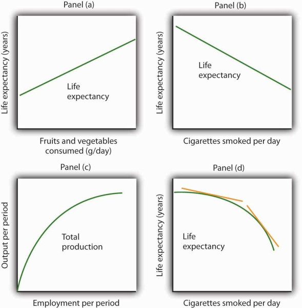
We often use graphs without numbers to suggest the nature of relationships between variables. The graphs in the four panels correspond to the relationships described in the text.
Panel (b) illustrates another hypothesis we hear often: smoking cigarettes reduces life expectancy. Here the number of cigarettes smoked per day is the independent variable; life expectancy is the dependent variable. The hypothesis suggests a negative relationship. Hence, we have a downward-sloping curve.
Now consider a general form of the hypothesis suggested by the example of Felicia Alvarez’s bakery: increasing employment each period increases output each period, but by smaller and smaller amounts. As we saw in Figure 20.14, this hypothesis suggests a positive, nonlinear relationship. We have drawn a curve in Panel
(c) of Figure 20.17 that looks very much like the curve for bread production in Figure 20.16. It is upward sloping, and its slope diminishes as employment rises.
Finally, consider a refined version of our smoking hypothesis. Suppose we assert that smoking cigarettes does reduce life expectancy and that increasing the number of cigarettes smoked per day reduces life expectancy by a larger and larger amount. Panel (d) shows this case. Again, our life expectancy curve slopes downward. But now it suggests that smoking only a few cigarettes per day reduces life expectancy only a little but that life expectancy falls by more and more as the number of cigarettes smoked per day increases.
We have sketched lines tangent to the curve in Panel (d). The slopes of these tangent lines are negative, suggesting the negative relationship between smoking and life expectancy. They also get steeper as the number of cigarettes smoked per day rises. Whether a curve is linear or nonlinear, a steeper curve is one for which the absolute value of the slope rises as the value of the variable on the horizontal axis rises. When we speak of the absolute value of a negative number such as −4, we ignore the minus sign and simply say that the absolute value is 4. The absolute value of −8, for example, is greater than the absolute value of −4, and a curve with a slope of −8 is steeper than a curve whose slope is −4.
Thus far our work has focused on graphs that show a relationship between variables. We turn finally to an examination of graphs and charts that show values of one or more variables, either over a period of time or at a single point in time.
KEY TAKEAWAYS
- The slope of a nonlinear curve changes as the value of one of the variables in the relationship shown by the curve changes.
- A nonlinear curve may show a positive or a negative relationship.
- The slope of a curve showing a nonlinear relationship may be estimated by computing the slope between two points on the curve. The slope at any point on such a curve equals the slope of a line drawn tangent to the curve at that point.
- We can illustrate hypotheses about the relationship between two variables graphically, even if we are not given numbers for the relationships. We need only draw and label the axes and then draw a curve consistent with the hypothesis.
TRY IT!
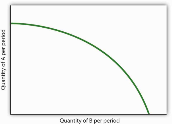
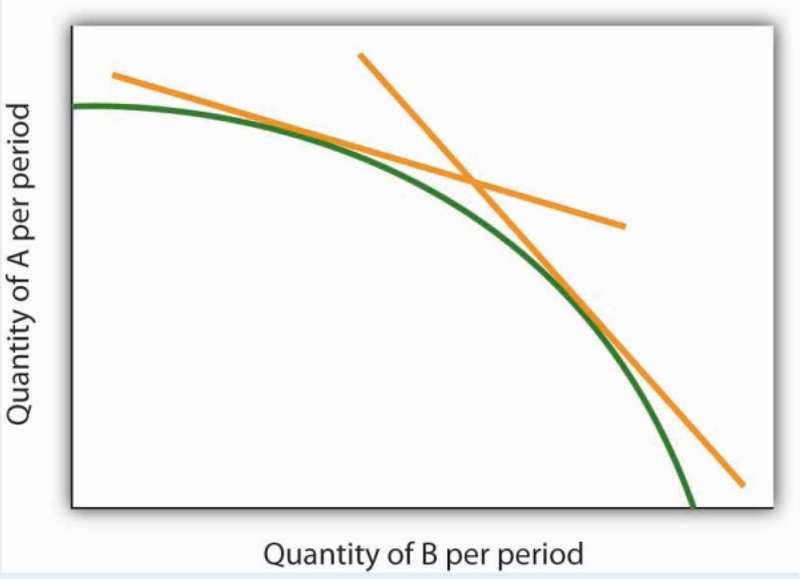
Consider the following curve drawn to show the relationship between two variables, A and B (we will be using a curve like this one in the next chapter). Explain whether the relationship between the two variables is positive or negative, linear or nonlinear. Sketch two lines tangent to the curve at different points on the curve, and explain what is happening to the slope of the curve.
ANSWER TO TRY IT!
The relationship between variable A shown on the vertical axis and variable B shown on the horizontal axis is negative. This is sometimes referred to as an inverse relationship. Variables that give a straight line with a constant slope are said to have a linear relationship. In this case, however, the relationship is nonlinear. The slope changes all along the curve. In this case the slope becomes steeper as we move downward to the right along the curve, as shown by the two tangent lines that have been drawn. As the quantity of B increases, the quantity of A decreases at an increasing rate.
- 3092 reads
