


Before we take up the discussion of linear regression and correlation, we need to examine a way to display the relation between two variables x and y. The most common and easiest way is a scatter plot. The following example illustrates a scatter plot.
Example 6.5
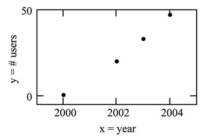
From an article in the Wall Street Journal: In Europe and Asia, m-commerce is popular. M-commerce users have special mobile phones that work like electronic wallets as well as provide phone and Internet services. Users can do everything from paying for parking to buying a TV set or soda from a machine to banking to checking sports scores on the Internet. For the years 2000 through 2004, was there a relationship between the year and the number of m-commerce users? Construct a scatter plot. Let x = the year and let y = the number of m-commerce users, in millions.
|
x (year) |
y (# of users) |
|---|---|
|
2000 |
0.5 |
|
2002 |
20.0 |
|
2003 |
33.0 |
|
2004 |
47.0 |
A scatter plot shows the direction and strength of a relationship between the variables. A clear direction happens when there is either:
- High values of one variable occurring with high values of the other variable or low values of one variable occurring with low values of the other variable.
- High values of one variable occurring with low values of the other variable.
You can determine the strength of the relationship by looking at the scatter plot and seeing how close the points are to a line, a power function, an exponential function, or to some other type of function.
When you look at a scatterplot, you want to notice the overall pattern and any deviations from the pattern. The following scatterplot examples illustrate these concepts.
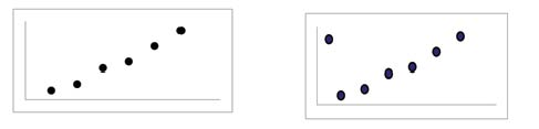
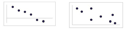
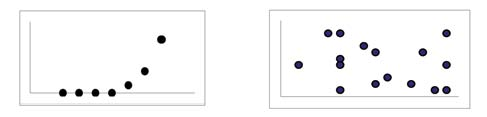
In this chapter, we are interested in scatter plots that show a linear pattern. Linear patterns are quite common. The linear relationship is strong if the points are close to a straight line. If we think that the points show a linear relationship, we would like to draw a line on the scatter plot. This line can be calculated through a process called linear regression. However, we only calculate a regression line if one of the variables helps to explain or predict the other variable. If x is the independent variable and y the dependent variable, then we can use a regression line to predict y for a given value of x.
- 4489 reads
