


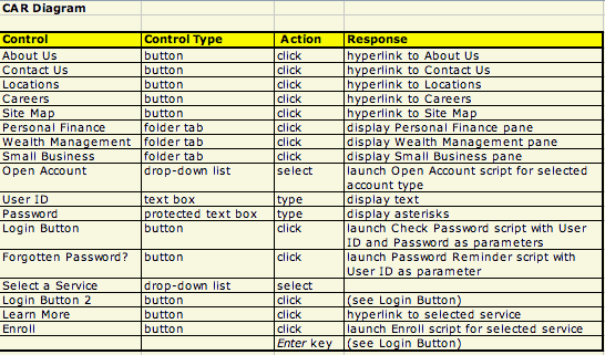
The interaction flow follows directly from the functional requirements, and in particular the process descriptions or schematics (DFDs or “swimlane” diagrams) described in section 5 above. To revert to our default example of a web- based application using a PC with a mouse, a keyboard , a VDU and a printer, you need to develop detailed layouts of screens and printouts (you can use presentation software such as Powerpoint to mock up these) and descriptions of what the system does in response to each possible user action—entering text, clicking on radio buttons, check boxes and navigation arrows, or pressing the Tab or Enter keys, for example. For each item that the user can act on, also called a control, you describe all the possible user actions and for each of those, the system’s processing and possible responses. (This is called by some a Control-Action-Response, or CAR, diagram, an example of which is shown in Figure 3.2.)
For each process, you have a choice between two basic interaction styles, system-driven and user-driven. System- driven systems take usually either a question-and-answer approach or a menu-and-forms approach. Take as an example an income tax filing application. One approach is to have the system ask a series of questions in a sequence that is determined by the designer, prompting successively for the taxpayer’s name, ID number, marital status, income from salary, taxes withheld, and so on. This is a very appropriate method for an individual taxpayer, who does this only once a year and whose knowledge of the intricacies of what you have to report and on which form is limited.
For a tax preparer with multiple clients, a menu-and-forms approach may be better. The user can choose which form to fill in from a menu; in response, the system displays a screen image of the form and the user can fill it in, using the Tab key to move back and forth between fields and character, arrow, backspace and delete keys to fill in each field on the form.
A third form of system-driven interaction, often neglected because the interaction itself is minimal, is batch processing. The best example comes from periodic applications such as utility billing or bank statement printing. In these examples, the processing is initiated by a timer(every night at 1:30, or every Monday, etc...). An entire file or database is processed without human intervention and the result is distributed by electronic (email) or physical (“snail” mail) when the processing is complete. A useful trick for weekly or monthly applications that print out large volumes of data is to organize the process by slicing the input file into segments—as many segments as there are days in the period. For instance, for a monthly application, you could print out all the customers whose name begin with A one night, B the second night, and so on. This is called cycle billing and is in general use.
Other types of applications may be best served by a user-driven approach. One example is Internet navigation, where the user can look up information (for instance in an on-line product catalog) by navigating freely from web page to web page, following links or invoking embedded search functions. As he or she finds products that are of interest, they are put in a shopping cart; at the end, when the user wants to confirm the order, the application takes on a system-driven character again, to enter delivery, invoicing and payment data.
Another example of a user-driven application is the spreadsheet. The user is given a variety of tools and functions: putting them together step by step enables him or her to complete the task at hand, whether it is to compute loan amortization calendars or organize the music collection of a church choir. Spreadsheet software is in fact so flexible that it is questionable whether to call it an application at all; it is more like a tool. In fact, many organizations create applications from spreadsheet software by distributing preformatted templates: budgeting and expense tracking are often treated this way. In this case, you could argue that the spreadsheet software is like a programming language and the template is the true application.
A final consideration is that of user identification and authentication. Most networked applications deal with resources that must not be tampered with—whether it is selling products or giving access to confidential information. In these cases, any user should be identified—who is it?—and authenticated—is the user really who he or she says? The usual procedure is to assign the user an identifier the first time he or she uses the application. This identifier is then stored by the system and permits subsequent activities. In addition, associated with the identifier is a password that only the legitimate user is to know. When logging in, the user supplies both the identifier and password. The combination of the two, if correct, authenticates the user who is then authorized to use the application.
The choice of style and flow thus depends on the application, but also on the user population. An inappropriate interaction style can cause a system to fail, especially if the users of the system are outside your control (e.g., the general population) and have a choice whether or not to use the system. This is a little less critical if the system is aimed at the employees of your organization, but a poorly designed interface can only have detrimental consequences: loss of productivity and lack of cooperation to cite only two.
The following are some guidelines for good interface design. The list is not exhaustive, but it contains some hints that you may not otherwise have though of; user interface design is a vast subject and you should reference the ample literature before starting. 1
- Do not consider yourself a surrogate user, thinking, “This is how I would do it if I were to use the system.” You are not. You have a different educational and professional background. Get help from actual users to evaluate your design.
- Be consistent. Use the same controls and actions to accomplish similar functions. If you use feedback cues such as icons, color, fonts, sounds, etc..., make sure they are associated systematically with the same actions throughout. For instance, if you want to use a garbage can icon to discard unneeded data, then make sure you always use the same garbage can icon, in the same place on the screen, and with the same “Oops” function.
- Provide “Oops” functions at all points where it seems useful. Users are often afraid to use system functions, especially those they don’t use very often, because they are afraid that the consequence of an error may be to break the system. Consistently having “Oops” or Undo functions available makes the system much more usable.
- Pay attention to users who have some physical impairment, such as color blindness, vision or hearing impairment, only one arm... Do not rely exclusively on color or sound to convey information.
- Make it very clear when a transaction, a data base update, or other irrevocable action has been performed, at what is called a commitment point.
- Do not overcrowd screens and reports, but don’t commit the opposite error either: you do not want to devote a whole screen to a single item of data.
- Avoid distracting graphics and decorative elements, especially for high-usage systems. “Pizzazz” may be fun the first time, but users quickly get tired of it.
- Pay special attention to error processing. Make sure the user understands what is wrong and which steps to take to correct it. Anticipate that the user will try to perform unexpected actions and design the interface to react accordingly.
- Let the user choose the identifier and the password with as few constraints as you can. This is especially valid for external customers and occasional users. You can be more demanding with frequent users, especially within your own organization—assigning an ID rather than letting the user choose, forcing a mix of alphabetic and numeric characters for the password, making the user change the password periodically. (To force this discipline on occasional users—who may not use the system for months at a time—is counterproductive, because he or she is likely to compromise password security by writing it down.)
- 2640 reads
