


As we have seen throughout the book, many interesting statistical relationships take the form of correlations between quantitative variables. For example, researchers Kurt Carlson and Jacqueline Conard conducted a study on the relationship between the alphabetical position of the first letter of people’s last names (from A = 1 to Z = 26) and how quickly those people responded to consumer appeals (Carlson & Conard, 2011). 1 In one study, they sent e-mails to a large group of MBA students, offering free basketball tickets from a limited supply. The result was that the further toward the end of the alphabet students’ last names were, the faster they tended to respond. These results are summarized in Figure 12.6.
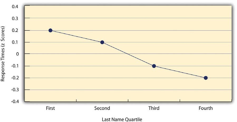
Such relationships are often presented using line graphs or scatterplots, which show how the level of one variable differs across the range of the other. In the line graph in Figure 12.6, for example, each point represents the mean response time for participants with last names in the first, second, third, and fourth quartiles (or quarters) of the name distribution. It clearly shows how response time tends to decline as people’s last names get closer to the end of the alphabet. The scatterplot in Figure 12.7, which is reproduced from Psychological Measurement, shows the relationship between 25 research methods students’ scores on the Rosenberg Self-Esteem Scale given on two occasions a week apart. Here the points represent individuals, and we can see that the higher students scored on the first occasion, the higher they tended to score on the second occasion. In general, line graphs are used when the variable on the x-axis has (or is organized into) a small number of distinct values, such as the four quartiles of the name distribution. Scatterplots are used when the variable on the x-axis has a large number of values, such as the different possible self-esteem scores.
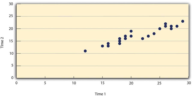
The data presented in Figure 12.7 provide a good example of a positive relationship, in which higher scores on one variable tend to be associated with higher scores on the other (so that the points go from the lower left to the upper right of the graph). The data presented in Figure 12.6 provide a good example of a negative relationship, in which higher scores on one variable tend to be associated with lower scores on the other (so that the points go from the upper left to the lower right).
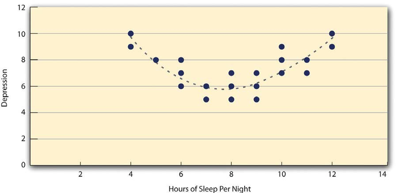
Both of these examples are also linear relationships, in which the points are reasonably well fit by a single straight line. Nonlinear relationships are those in which the points are better fit by a curved line. Figure 12.8, for example, shows a hypothetical relationship between the amount of sleep people get per night and their level of depression. In this example, the line that best fits the points is a curve—a kind of upside down “U”—because people who get about eight hours of sleep tend to be the least depressed, while those who get too little sleep and those who get too much sleep tend to be more depressed. Nonlinear relationships are not uncommon in psychology, but a detailed discussion of them is beyond the scope of this book.
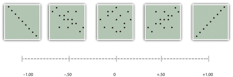
As we saw earlier in the book, the strength of a correlation between quantitative variables is typically measured using a statistic called Pearson’s r. As Figure 12.9 shows, its possible values range from −1.00, through zero, to +1.00. A value of 0 means there is no relationship between the two variables. In addition to his guidelines for interpreting Cohen’s d, Cohen offered guidelines for interpreting Pearson’s rin psychological research (see Table 12.3). Values near ±.10 are considered small, values near ± .30 are considered medium, and values near ±.50 are considered large. Notice that the sign of Pearson’s ris unrelated to its strength. Pearson’s rvalues of +.30 and −.30, for example, are equally strong; it is just that one represents a moderate positive relationship and the other a moderate negative relationship. Like Cohen’s d, Pearson’s ris also referred to as a measure of “effect size” even though the relationship may not be a causal one.
The computations for Pearson’s rare more complicated than those for Cohen’s d. Although you may never have to do them by hand, it is still instructive to see how. Computationally, Pearson’s ris the “mean cross- product of z scores.” To compute it, one starts by transforming all the scores to z scores. For the X variable, subtract the mean of X from each score and divide each difference by the standard deviation of X. For the Y variable, subtract the mean of Y from each score and divide each difference by the standard deviation of Y. Then, for each individual, multiply the two zscores together to form a cross-product. Finally, take the mean of the cross-products. The formula looks like this:
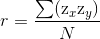
Table 12.5 Sample Computations for Pearson’s r illustrates these computations for a small set of data. The first column lists the scores for the X variable, which has a mean of 4.00 and a standard deviation of 1.90. The second column is the z-score for each of these raw scores. The third and fourth columns list the raw scores for the Y variable, which has a mean of 40 and a standard deviation of 11.78, and the corresponding z scores. The fifth column lists the cross-products. For example, the first one is 0.00 multiplied by −0.85, which is equal to 0.00. The second is 1.58 multiplied by 1.19, which is equal to 1.88. The mean of these cross-products, shown at the bottom of that column, is Pearson’s r, which in this case is +.53. There are other formulas for computing Pearson’s r by hand that may be quicker. This approach, however, is much clearer in terms of communicating conceptually what Pearson’s r is.
|
X |
zx |
Y |
zy |
zxzy |
|
4 |
0.00 |
30 |
−0.85 |
0.00 |
|
7 |
1.58 |
54 |
1.19 |
1.88 |
|
2 |
−1.05 |
23 |
−1.44 |
1.52 |
|
5 |
0.53 |
43 |
0.26 |
0.13 |
|
2 |
−1.05 |
50 |
0.85 |
−0.89 |
|
Mx= 4.00 |
My= 40.00 |
r = 0.53 |
||
|
SDx= 1.90 |
SDy= 11.78 |
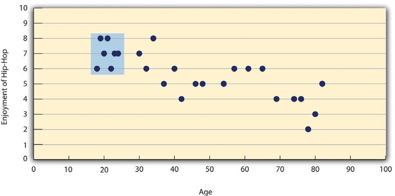
There are two common situations in which the value of Pearson’s rcan be misleading. One is when the relationship under study is nonlinear. Even though Figure 12.8 shows a fairly strong relationship between depression and sleep, Pearson’s rwould be close to zero because the points in the scatterplot are not well fit by a single straight line. This means that it is important to make a scatterplot and confirm that a relationship is approximately linear before using Pearson’s r. The other is when one or both of the variables have a limited range in the sample relative to the population. This is referred to as restriction of range. Assume, for example, that there is a strong negative correlation between people’s age and their enjoyment of hip hop music as shown by the scatterplot in Figure 12.10. Pearson’s r here is −.77. However, if we were to collect data only from 18- to 24-year-olds—represented by the shaded area of Figure 12.10—then the relationship would seem to be quite weak. In fact, Pearson’s rfor this restricted range of ages is 0. It is a good idea, therefore, to design studies to avoid restriction of range. For example, if age is one of your primary variables, then you can plan to collect data from people of a wide range of ages. Because restriction of range is not always anticipated or easily avoidable, however, it is good practice to examine your data for possible restriction of range and to interpret Pearson’s rin light of it. (There are also statistical methods to correct Pearson’s rfor restriction of range, but they are beyond the scope of this book).
KEY TAKEAWAYS
- Differences between groups or conditions are typically described in terms of the means and standard deviations of the groups or conditions or in terms of Cohen’s d and are presented in bar graphs.
- Cohen’s d is a measure of relationship strength (or effect size) for differences between two group or condition means. It is the difference of the means divided by the standard deviation. In general, values of ±0.20, ±0.50, and ±0.80 can be considered small, medium, and large, respectively.
- Correlations between quantitative variables are typically described in terms of Pearson’s rand presented in line graphs or scatterplots.
- Pearson’s ris a measure of relationship strength (or effect size) for relationships between quantitative variables. It is the mean cross-product of the two sets of z scores. In general, values of ±.10, ±.30, and ±.50 can be considered small, medium, and large, respectively.
EXERCISES
- Practice: The following data represent scores on the Rosenberg Self-Esteem Scale for a sample of 10 Japanese college students and 10 American college students. (Although hypothetical, these data are consistent with empirical findings [Schmitt & Allik, 2005]. 2) Compute the means and standard deviations of the two groups, make a bar graph, compute Cohen’s d, and describe the strength of the relationship in words.
| Japan | United States |
| 25 | 27 |
| 20 | 30 |
| 24 | 34 |
| 28 | 37 |
| 30 | 26 |
| 32 | 24 |
| 21 | 28 |
| 24 | 35 |
| 20 | 33 |
| 26 | 36 |
- Practice: The hypothetical data that follow are extroversion scores and the number of Facebook friends for 15 college students. Make a scatterplot for these data, compute Pearson’s r, and describe the relationship in words.
| Extroversion | Facebook Friends |
| 8 | 75 |
| 10 | 315 |
| 4 | 28 |
| 6 | 214 |
| 12 | 176 |
| 14 | 95 |
| 10 | 120 |
| 11 | 150 |
| 4 | 32 |
| 13 | 250 |
| 5 | 99 |
| 7 | 136 |
| 8 | 185 |
| 11 | 88 |
| 10 | 144 |
- 4132 reads
