


To see how a graph is constructed from numerical data, we will consider a hypothetical example. Suppose a college campus has a ski club that organizes day-long bus trips to a ski area about 100 miles from the campus. The club leases the bus and charges $10 per passenger for a round trip to the ski area. In addition to the revenue the club collects from passengers, it also receives a grant of $200 from the school’s student government for each day the bus trip is available. The club thus would receive $200 even if no passengers wanted to ride on a particular day.
The table in Figure 20.3 shows the relationship between two variables: the number of students who ride the bus on a particular day and the revenue the club receives from a trip. In the table, each combination is assigned a letter (A, B, etc.); we will use these letters when we transfer the information from the table to a graph.
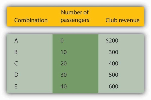
The ski club receives $10 from each passenger riding its bus for a trip to and from the ski area plus a payment of $200 from the student government for each day the bus is available for these trips. The club’s revenues from any single day thus equal $200 plus $10 times the number of passengers. The table relates various combinations of the number of passengers and club revenues.
We can illustrate the relationship shown in the table with a graph. The procedure for showing the relationship between two variables, like the ones in Figure 20.3, on a graph is illustrated in Figure 20.4. Let us look at the steps involved.
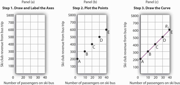
Here we see how to show the information given in Figure 20.3in a graph.
- 3034 reads
