


One of the most common types of graphs used in economics is called a time-series graph. A time-series graph shows how the value of a particular variable or variables has changed over some period of time. One of the variables in a time-series graph is time itself. Time is typically placed on the horizontal axis in time-series graphs. The other axis can represent any variable whose value changes over time.
The table in Panel (a) of Figure 20.20 shows annual values of the unemployment rate, a measure of the percentage of workers who are looking for and available for work but are not working, in the United States from 1998 to 2007. The grid with which these values are plotted is given in Panel (b). Notice that the vertical axis is scaled from 3 to 8%, instead of beginning with zero. Time-series graphs are often presented with the vertical axis scaled over a certain range. The result is the same as introducing a break in the vertical axis, as we did in Figure 20.7
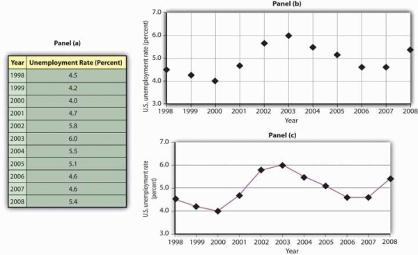
Panel (a) gives values of the U.S. unemployment rate from 1998 to 2008. These points are then plotted in Panel (b). To draw a time-series graph, we connect these points, as in Panel (c).
The values for the U.S. unemployment rate are plotted in Panel (b) of Figure 20.20. The points plotted are then connected with a line in Panel (c).
- 2411 reads
