


John Maynard Keynes, one of the most famous economists ever, proposed in 1936 a hypothesis about total spending for consumer goods in the economy. He suggested that this spending was positively related to the income households receive. One way to test such a hypothesis is to draw a time-series graph of both variables to see whether they do, in fact, tend to move together. Figure 20.22 shows the values of consumption spending and disposable income, which is after-tax income received by households. Annual values of consumption and disposable income are plotted for the period 1960–2007. Notice that both variables have tended to move quite closely together. The close relationship between consumption and disposable income is consistent with Keynes’s hypothesis that there is a positive relationship between the two variables.
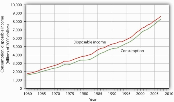
Plotted in a time-series graph, disposable income and consumption appear to move together. This is consistent with the hypothesis that the two are directly related.
Source: Department of Commerce
The fact that two variables tend to move together in a time series does not by itself prove that there is a systematic relationship between the two. Figure 20.23 shows a time-series graph of monthly values in 1987 of the Dow Jones Industrial Average, an index that reflects the movement of the prices of common stock. Notice the steep decline in the index beginning in October, not unlike the steep decline in October 2008.
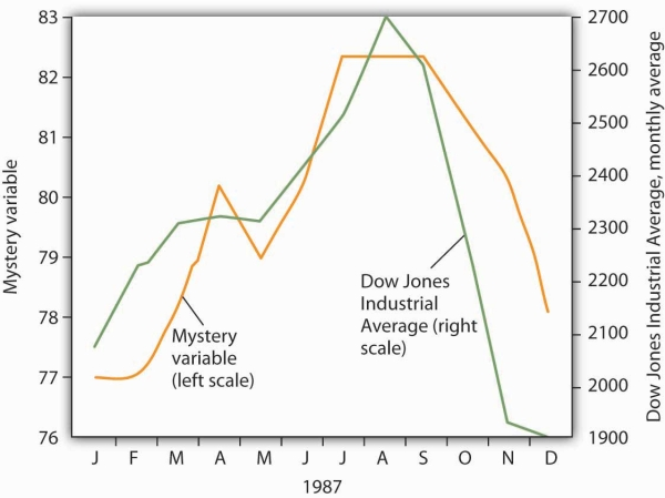
The movement of the monthly average of the Dow Jones Industrial Average, a widely reported index of stock values, corresponded closely to changes in a mystery variable, X. Did the mystery variable contribute to the crash?
It would be useful, and certainly profitable, to be able to predict such declines. Figure 20.23 also shows the movement of monthly values of a “mystery variable,” X, for the same period. The mystery variable and stock prices appear to move closely together. Was the plunge in the mystery variable in October responsible for the stock crash? The answer is: Not likely. The mystery value is monthly average temperatures in San Juan, Puerto Rico. Attributing the stock crash in 1987 to the weather in San Juan would be an example of the fallacy of false cause.
Notice that Figure 20.23 has two vertical axes. The left-hand axis shows values of temperature; the right-hand axis shows values for the Dow Jones Industrial Average. Two axes are used here because the two variables, San Juan temperature and the Dow Jones Industrial Average, are scaled in different units.
- 2055 reads
