


We can use a table to show data. Consider, for example, the information compiled each year by the Higher Education Research Institute (HERI) at UCLA. HERI conducts a survey of first-year college students throughout the United States and asks what their intended academic majors are. The table in Panel (a) of Figure 20.24 shows the results of the 2007 survey. In the groupings given, economics is included among the social sciences.
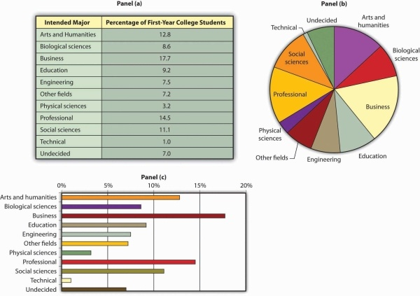
Panels (a), (b), and (c) show the results of a 2007 survey of first-year college students in which respondents were asked to state their intended academic major. All three panels present the same information. Panel (a) is an example of a table, Panel (b) is an example of a pie chart, and Panel (c) is an example of a horizontal bar chart.
Source: Higher Education Research Institute, 2007 Freshman Survey. Percentages shown are for broad academic areas, each of which includes several majors. For example, the social sciences include such majors as economics, political science, and sociology; business includes such majors as accounting, finance, and marketing; technical majors include electronics, data processing/computers, and drafting.
Panels (b) and (c) of Figure 20.24 present the same information in two types of charts. Panel (b) is an example of a pie chart; Panel (c) gives the data in a bar chart. The bars in this chart are horizontal; they may also be drawn as vertical. Either type of graph may be used to provide a picture of numeric information.
KEY TAKEAWAYS
- A time-series graph shows changes in a variable over time; one axis is always measured in units of time.
- One use of time-series graphs is to plot the movement of two or more variables together to see if they tend to move together or not. The fact that two variables move together does not prove that changes in one of the variables cause changes in the other.
- Values of a variable may be illustrated using a table, a pie chart, or a bar chart.
TRY IT!
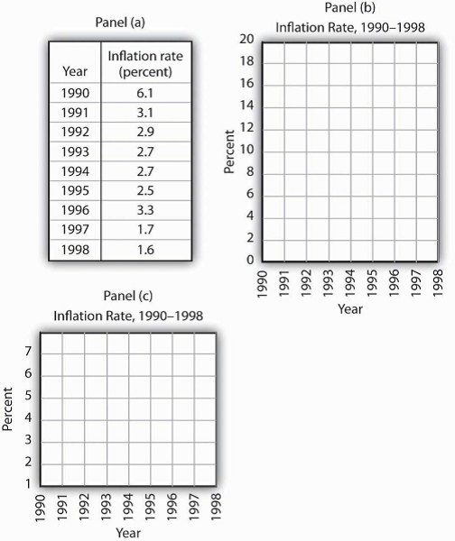
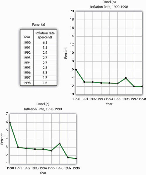
The table in Panel (a) shows a measure of the inflation rate, the percentage change in the average level of prices below. Panels (b) and (c) provide blank grids. We have already labeled the axes on the grids in Panels (b) and (c). It is up to you to plot the data in Panel
(a) on the grids in Panels (b) and (c). Connect the points you have marked in the grid using straight lines between the points. What relationship do you observe? Has the inflation rate generally increased or decreased? What can you say about the trend of inflation over the course of the 1990s? Do you tend to get a different “interpretation” depending on whether you use Panel (b) or Panel (c) to guide you?
ANSWER TO TRY IT!
Here are the time-series graphs, Panels (b) and (c), for the information in Panel (a). The first thing you should notice is that both graphs show that the inflation rate generally declined throughout the 1990s (with the exception of 1996, when it increased). The generally downward direction of the curve suggests that the trend of inflation was downward. Notice that in this case we do not say negative, since in this instance it is not the slope of the line that matters. Rather, inflation itself is still positive (as indicated by the fact that all the points are above the origin) but is declining. Finally, comparing Panels (b) and (c) suggests that the general downward trend in the inflation rate is emphasized less in Panel (b) than in Panel (c). This impression would be emphasized even more if the numbers on the vertical axis were increased in Panel (b) from 20 to 100. Just as in Figure 20.21, it is possible to make large changes appear trivial by simply changing the scaling of the axes.
PROBLEMS
- Panel (a) shows a graph of a positive relationship; Panel (b) shows a graph of a negative relationship. Decide whether each proposition below
demonstrates a positive or negative relationship, and decide which graph you would expect to illustrate each proposition. In each statement, identify which variable is the independent
variable and thus goes on the horizontal axis, and which variable is the dependent variable and goes on the vertical axis.
 Figure 20.26
- An increase in national income in any one year increases the number of people killed in highway accidents.
- An increase in the poverty rate causes an increase in the crime rate.
- As the income received by households rises, they purchase fewer beans.
- As the income received by households rises, they spend more on home entertainment equipment.
- The warmer the day, the less soup people consume.
- Suppose you have a graph showing the results of a survey asking people how many left and right shoes they owned. The results suggest that people
with one left shoe had, on average, one right shoe. People with seven left shoes had, on average, seven right shoes. Put left shoes on the vertical axis and right shoes on the horizontal
axis; plot the following observations:
Is this relationship positive or negative? What is the slope of the curve?Left shoes 1 2 3 4 5 6 7 Right shoes 1 2 3 4 5 6 7 - Suppose your assistant inadvertently reversed the order of numbers for right shoe ownership in the survey above. You thus have the following table
of observations:
Is the relationship between these numbers positive or negative? What’s implausible about that?Left shoes 1 2 3 4 5 6 7 Right shoes 7 6 5 4 3 2 1 - Suppose some of Ms. Alvarez’s kitchen equipment breaks down. The following table gives the values of bread output that were shown
in Figure 20.14 It also gives
the new levels of bread output that Ms. Alvarez’s bakers produce following the breakdown. Plot the two curves. What has happened?
A B C D E F G Bakers/day 0 1 2 3 4 5 6 Loaves/ day 0 400 700 900 1,000 1,050 1,075 Loaves/ day after breakdown 0 380 670 860 950 990 1,005 -
Steven Magee has suggested that there is a
relationship between the number of lawyers per capita in a country and the country’s rate of economic growth. The relationship is described with the following Magee curve.
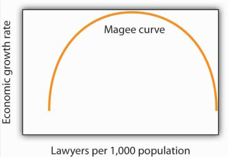 Figure 20.27What do you think is the argument made by the curve? What kinds of countries do you think are on the upward-sloping region of the curve? Where would you guess the United States is? Japan? Does the Magee curve seem plausible to you?
 -
Draw graphs showing the likely relationship between each of the following pairs of variables. In each case, put the first variable mentioned on
the horizontal axis and the second on the vertical axis.
- The amount of time a student spends studying economics and the grade he or she receives in the course
- Per capita income and total expenditures on health care
- Alcohol consumption by teenagers and academic performance
- Household income and the likelihood of being the victim of a violent crime
- 3019 reads
