


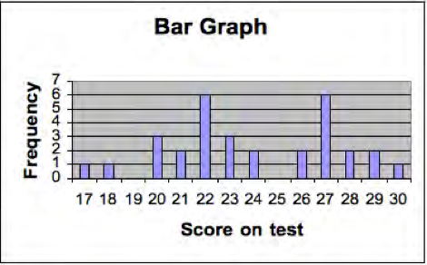
A frequency distribution is a listing of the number of students who obtained each score on a test. If 31 students take a test, and the scores range from 11 to 30 then the frequency distribution might look like Table 12.2. We also show the same set of scores on a histogram or bar graph in the Figure 12.5. The horizontal (or x axis) represents the score on the test and the vertical axis (y axis) represents the number or frequency of students. Plotting a frequency distribution helps us see what scores are typical and how much variability there are in the scores. We describe more precise ways of determining typical scores and variability next.
|
Score on test |
Frequency |
Central tendency measures |
|
17 |
1 |
|
|
18 |
1 |
|
|
19 |
0 |
|
|
20 |
3 |
|
|
21 |
2 |
|
|
22 |
6 |
Mode |
|
23 |
3 |
Median |
|
24 |
2 |
Mean |
|
25 |
0 |
|
|
26 |
2 |
|
|
27 |
6 |
Mode |
|
28 |
2 |
|
|
29 |
2 |
|
|
30 |
1 |
|
|
TOTAL |
31 |
- 4024 reads
