


In Figure 10.6 we generalize the
graphical representation of the monopoly profit maximizing output by allowing the MC curve to be nonlinear, and by introducing the ATC curve. The optimal output is at  , where MR = MC, and the price
  sustains that output. With the average cost known, profit per unit is AB, and therefore total profit is this margin multiplied
by the number of units sold,
sustains that output. With the average cost known, profit per unit is AB, and therefore total profit is this margin multiplied
by the number of units sold,  .
.
Total profit is therefore  .
.
Note that the monopolist may not always make a profit. Losses could result in Figure 10.6 if average costs were to rise with no change in demand conditions 1. For example, if the ATC curve shifted upwards so that it lay everywhere above the demand curve, and the MC remained unchanged, then the output where MC = MR is again QE. In this case losses would result. In the longer term the monopolist would have to either reduce costs or perhaps stimulate demand through advertising if she wanted to continue in operation.
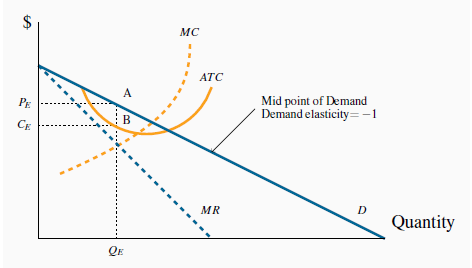
The profit maximizing output is  , where MC = MR. This output can be
sold at a price
, where MC = MR. This output can be
sold at a price  . The cost per unit of
  is read from the ATC curve, and equals B. Per unit profit is therefore AB and total
profit is
is read from the ATC curve, and equals B. Per unit profit is therefore AB and total
profit is  .
.
- 2649 reads
