Much of our economic analysis can be developed with the help of simple two-dimensional linear diagrams. Such diagrams and graphics contain economic information – information that can be obtained by examining the properties of the regression lines that we fit through scatter plots. Consider another linear example: Imagine that we survey a group of economics students on their car use and how it would vary with a tax imposed on gasoline. Such a tax might be a carbon tax designed to reduce greenhouse gases. Our survey involves asking them how many liters of gas they would purchase at different tax rates. Evidently, at high rates they purchase less and at low rates they purchase more.
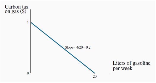
Having performed the survey, and plotted the scatter of points that represent their answers, we again fit a regression line through the points and project this regression line to meet each axis. The outcome to our experiment is represented in Figure 2.6. The line meets the vertical axis at a value of $4 and the horizontal axis at 20 liters. The $4 intercept value means that if the tax, which goes on top of the distributor’s price, becomes this high, no student will drive their car (gasoline purchases are zero). In contrast, if the tax falls towards zero and only the distributor’s price is payable, students will use 20 liters of gas per week. And the downward slope of the line tells us that more gasoline is purchased at lower tax rates.
When the function is a straight line, two pieces of information fully describe the relationship: the intercept and the slope. The vertical intercept is the height of the line when the variable on the horizontal axis has a zero value – in Figure 2.6 it has a value of 4.
 Intercept of a line: height of the line on one
axis when the value of the variable on the other axis is zero.

The slope of the line indicates the amount by which the variable on the vertical axis increases in response to a change in the value of the variable on the horizontal axis. Since this is a straight line, the slope is constant throughout. It is measured as the ratio of the vertical distance divided by the horizontal distance for any segment of the line.
 Slope of a line: ratio of the change in the
value of the variable measured on the vertical axis to the change in the value of the variable measured on the horizontal axis (i.e.: rise/run).
In this example, that ratio is given by -4/20 = -1/5 = -0.2. It is negative, since an increase in one variable is associated with a decrease in the other. We can now define a linear equation for this regression line:
T = 4 - 0.2 X L.
T denotes the tax and L defines the liters of gas. To verify that this indeed represents the line, remember that the (vertical) intercept reflects the value of T when L is zero. In this equation a zero value of L yields:
T = 4 - 0.2 X 0 = 4.
Second, the number 0.2 is the slope. It indicates that, for every unit change in L, the T variable changes by 0.2 points. Since there is a negative sign governing the term, an increase in L is associated with a decline in T. In geometric terms; the line is negatively sloped.
It is worth repeating that this line is an average representation of the relationship between the two variables; it does not go through every point in the scatter diagram. For any value of one of the variables we feed into this equation, we obtain a corresponding value for the other variable.
The prediction therefore always lies on the line, whereas the actual value seldom does. When the predictions and the actual values are very close to one another, i.e., where the scatter is closely concentrated around the regression line, we say that the line is a good fit.
Finally note that economic relationships need not be linear; we could imagine fitting a slightly curved function through the scatter in Figure 2.5. Such a curved function might result in the points being slightly closer to such a line on average. But to maintain simplicity we will work with linear functions and lines throughout. Furthermore, economic relationships are not unchanging. Had we constructed a scatter plot for earlier or later years in Figure 2.5, the slope and intercepts of the regression line that best represented the extended data set might well have been different.
- 瀏覽次數:2364


