


Let us start by looking at the data. Suppose we rank the market incomes of all households in the economy from poor to rich, and categorize this ordering into different quantiles or groups. With five such quantiles the shares are called quintiles. The richest group forms the highest quintile while the poorest group forms the lowest quintile. Such a representation is given in Table 13.2. The first numerical column displays the income in each quintile as a percentage of total income. If we wanted a finer breakdown, we could opt for decile (ten), or even vintile (twenty) shares, rather than quintile shares. These data can be graphed in a variety of ways. Since the data are in share, or percentage, form, we can compare in a meaningful manner distributions from economies that have different average income levels.
| Quintile share of total income | Cumulative share | |
| First quintile | 4.1 | 4.1 |
| Second quintile | 9.7 | 13.8 |
| Third quintile | 15.6 | 29.4 |
| Fourth quintile | 23.7 | 53.1 |
| Fifth quintile | 46.8 | 100.0 |
| Total | 100 |
Source: Statistics Canada, CANSIM Matrix 2020405.
An interesting way of presenting these data graphically is to plot the cumulative share of income against the cumulative share of the population. This is given in the final column, and also presented graphically in Figure 13.3. The bottom quintile has 4.1% of total income. The bottom two quintiles together have 13.8% (4.1% + 9.7%), and so forth. By joining the coordinates of the resulting figure a Lorenz curve is obtained. Relative to the diagonal line it is a measure of how unequally incomes are distributed: if everyone had the same income, each 20% of the population would have 20% of total income and by joining the points for such a distribution we would get a straight diagonal line joining the corners of the box. In consequence, if the Lorenz curve is further from the line of equality the distribution is less equal than if the Lorenz curve is close in.
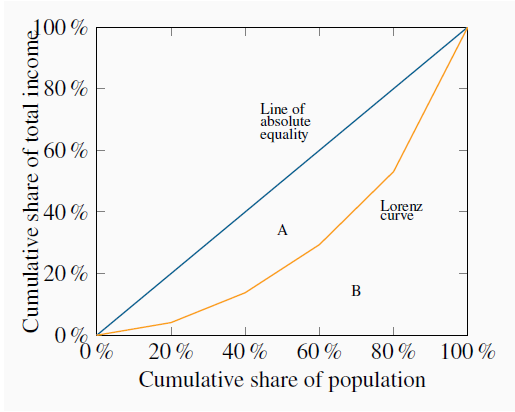
The more equal are the income shares, the closer is the Lorenz curve to the diagonal line of equality. The Gini index is the ratio of the area A to the area (A+B). The Lorenz curve plots the cumulative percentage of total income against the cumulative percentage of the population.
 Lorenz curve describes the cumulative percentage
of the income distribution going to different quantiles of the population.
Lorenz curve describes the cumulative percentage
of the income distribution going to different quantiles of the population.
This suggests that the area A relative to the area (A + B) forms a measure of inequality in the income distribution. This fraction obviously lies between zero and one, and it is called the Gini index. A larger value of the Gini index indicates that inequality is greater. We will not delve into the mathematical formula underlying the Gini. But for this set of numbers its value is 0.4.
 Gini index: a measure of how far the Lorenz curve
lies from the line of equality. Its maximum value is one; its minimum value is zero.
Gini index: a measure of how far the Lorenz curve
lies from the line of equality. Its maximum value is one; its minimum value is zero.
The Gini index is what is termed summary index of inequality – it encompasses a lot of information in one number. There exist very many other such summary statistics.
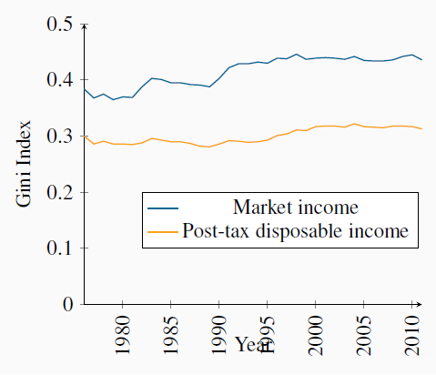
It is important to recognize that very different Gini index values emerge for a given economy by using different income definitions of the variable going into the calculations. For example, the quintile shares of the earnings of individuals rather than the incomes of households could be very different. Similarly, the shares of income post tax and post transfers will differ from their shares on a pre-tax, pre-transfer basis.
Figure 13.4 contains Gini index values for two different definitions of income from 1976 to 2010. Two messages emerge from this graphic: the first is that the distribution of market incomes displays more inequality than the distribution of incomes after the government has intervened. In the latter case incomes are more equally distributed than in the former. The second message to emerge is that inequality has increased over time – the Gini values are larger in the later years than in the earlier years.
Data source: Statistics Canada, CANSIM Table 202-0709
Application Box: The very rich
This is a very brief description of recent events. It is also possible to analyze inequality among women and men, for example, as well as among individuals and households. But the essential message remains clear: definitions are important; in particular the distinction between incomes generated in the market place and incomes after the government has intervened through its tax and transfer policies.
McMaster Professor Michael Veall and his colleague Emmanuel Saez, from Berkeley, have examined the evolution of the top fractiles of the Canadian earnings distribution in the twentieth century. A fractile is a fraction of a percent. Using individual earnings from a database built upon tax returns, they show how the share of the top one tenth of the top one percent declined in the nineteen thirties and forties, remained fairly stable in the decades following World War II, and then increased from the eighties to the present time. The share increased from 2.3% to 5.2% of the total in the period 1984 to 2000. Larger changes emerge if we use 1974 as a base, or look at a fraction of the top one percent. Furthermore, these results are driven by changes in basic earnings, not on stock options awarded to high-level corporate employees. The authors conclude that the change in this region of the distribution is attributable to changes in social norms. Whereas, in the nineteen eighties, it was expected that a top executive would earn perhaps a half million dollars, the ‘norm’ has become several million dollars in the present day. Such high remuneration became a focal point of public discussion after so many banks in the United States in 2008 and 2009 required government loans and support in order to avoid collapse. It also motivated the many ‘occupy’ movements of 2011 and 2012.
Saez, E. and M. Veall. “The evolution of high incomes in Canada, 1920-2000.” Department of Economics research paper, McMaster University, March 2003.
- 4512 reads
