


Our starting point is the classification of individuals in the civilian working age population. Recall that economic statistics place them as one of the following: employed, unemployed, or not in the labor force. Imagine taking a snapshot of the US economy each month. For a given month, you would be able to count the number of people employed, unemployed, and out of the labor force. We could call these the stocks of each kind of individual.
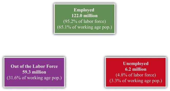
shows the number of people between 16 and 64 years old in the United States in three different “states”—employment, unemployment, and out of the labor force—over the period 1996–2003. [***These data come from a study using a monthly survey conducted by the Bureau of Labor Statistics (BLS) called the Current Population Survey and were compiled by Stephen J. Davis, Jason Faberman, and John Haltiwanger. The numbers here come from S. Davis, R. J. Faberman, and J. Haltiwanger, “The Flow Approach to Labor Market: New Data Sources and Micro-Macro Links” NBER Working Paper #12167, April 2006, accessed June 30, 2011,http://www.nber.org/papers/w12167.***] On average, there were 122 million people employed, 6.2 million unemployed, and 59.3 million considered out of the labor force. Adding these numbers together, there were 187.5 million working-age individuals, of whom 128.2 million were in the labor force. The average unemployment rate was 4.8 percent over this period, and the employment rate was 95.2 percent. Notice, though, that many individuals are out of the labor force: only 65 percent of the population is employed.
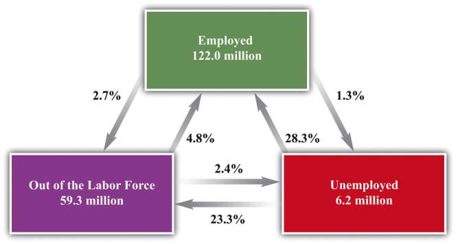
shows an average over many months, but you could also look at how these numbers change from month to month. Even more informatively, you could count the number of people who were employed in two consecutive months. This would tell you the likelihood of being employed two months in a row. These calculations for the US economy are summarized in. Look, for example, at the arrows associated with the box labeled unemployed. There are two arrows coming in: one from the employed box and one from the out-of-the-labor-force box. There are two arrows going out: one to the employed box and one to the out-of-the-laborforce box. Each of these four arrows has a percentage attached, indicating the fraction of people going from one box to another. Thus, on average, 28.3 percent of the unemployed people in one month are employed in the next and 23.3 percent leave the labor force. The remaining 48.4 percent stay in the group of unemployed.
The numbers in the figure are averages over a long period. Such flows change over the course of the year due to seasonal effects. Around Christmas, for example, it may be easier for an unemployed worker to find a job selling merchandise in a retail shop. These flows also change depending on the ups and downs of the aggregate economy.
Do European countries exhibit similar patterns? Portugal makes for a good comparison with the United States because the unemployment rates in the two countries were broadly similar over most of the last two decades. Yet Portugal has very strong employment protection laws, to the point where they are enshrined in the Portuguese Constitution: [***“Article 53,” Portugal-Constitution, adopted April 2, 1976, accessed June 30, 2011,http://www.servat.unibe.ch/icl/po00000_.html#A053_.***]
- 1396 reads
