


When several quality problems need to be solved, a project manager must choose which ones to address first. One way to prioritize quality problems is to determine which ones occur most frequently. This data can be collected using a check sheet, which is a basic form on which the user can make a check in the appropriate box each time a problem occurs or by automating the data collection process using the appropriate technology. Once the data are collected, they can be analyzed by creating a type of frequency distribution chart called a histogram. A true histogram is a column chart where the width of the columns fill the available space on the horizontal axis and are proportional to the category values displayed on the x axis, while the height of the columns is proportional to the frequency of occurrences. Most histograms use one width of column to represent a category, while the vertical axis represents the frequency of occurrence.
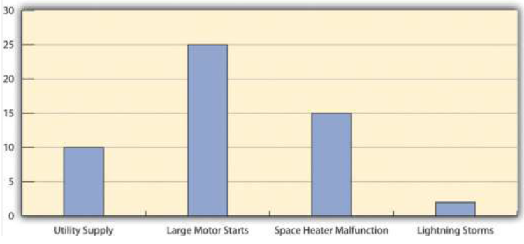
Charting Electrical Problems
The engineer and electrician place a recording meter on the electrical supply to the manufacturing area and instruct the building automation system to keep a log of voltage coming into the plant from the local utility and when it starts and stops large electrical fan motors. They create a check sheet to track the number of times that power dips or spikes due to lighting strikes or electric space heater malfunctions. They collect the data, count the number of occurrences in each category, and then chart the number of occurrences in a histogram, as shown in Figure 10.11.
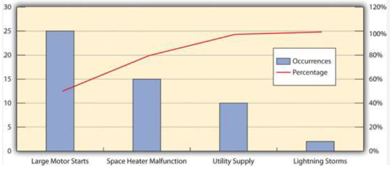
A variation on the histogram is a frequency distribution chart invented by economist Vilfredo Pareto known as a Pareto chart, in which the columns are arranged in decreasing order with the most common on the left and a line added that shows the cumulative total. The combination of columns and a line allows the user to tell at a glance which problems are most frequent and what fraction of the total they represent.
Using Pareto Chart to Analyze Voltage Problem
The engineer creates a Pareto chart by sorting the data and adds a line to show total problems, as shown in Figure 10.12. He concludes that about half of the electrical voltage problems are caused when one of the large electrical fan motors on the same circuit as the manufacturing line is shut down to conserve electricity by the energy management system and then restarted.
- 9896 reads
