


The t-distribution is a sampling distribution. You could generate your own t-distribution with n-1 degrees of freedom by starting with a normal population, choosing all possible samples of one size, n, computing a t-score for each sample:

where:  = the sample mean
 = the
population mean
= the
population mean
s = the sample standard deviation
n = the size of the sample.
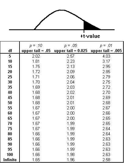
When you have all of the samples' t-scores, form a relative frequency distribution and you will have your t-distribution. Luckily, you do not have to generate your own t-distributions because any statistics book has a table that shows the shape of the t-distribution for many different degrees of freedom. Figure 5.1 A portion of a typical t-table reproduces a portion of a typical t-table. See below.
When you look at the formula for the t-score, you should be able to see that the mean t-score is zero because the mean of the  's is equal to
  . Because most samples have
  's that are close to
  , most will have t-scores that are close to zero. The t-distribution is symmetric, because half of the samples will have
  's greater than
  , and half less. As you can see from the table, if there are 10 df, only .005 of the samples taken from a normal population
will have a t-score greater than +3.17. Because the distribution is symmetric, .005 also have a t-score less than -3.17. Ninety-nine per cent of samples will have a t-score between ±3.17. Like
the example in Figure 5.1 A portion of a typical t-table , most t-tables have a picture
showing what is in the body of the table. In Figure 5.1 A portion of a typical t-table ,
the shaded area is in the right tail, the body of the table shows the t-score that leaves the α in the right tail. This t-table also lists the two-tail
, and half less. As you can see from the table, if there are 10 df, only .005 of the samples taken from a normal population
will have a t-score greater than +3.17. Because the distribution is symmetric, .005 also have a t-score less than -3.17. Ninety-nine per cent of samples will have a t-score between ±3.17. Like
the example in Figure 5.1 A portion of a typical t-table , most t-tables have a picture
showing what is in the body of the table. In Figure 5.1 A portion of a typical t-table ,
the shaded area is in the right tail, the body of the table shows the t-score that leaves the α in the right tail. This t-table also lists the two-tail  above the one-tail where p = .xx. For 5 df, there is a .05 probability that a sample
will have a t-score greater than 2.02, and a .10 probability that a sample will have a t score either > +2.02 or < -2.02.
above the one-tail where p = .xx. For 5 df, there is a .05 probability that a sample
will have a t-score greater than 2.02, and a .10 probability that a sample will have a t score either > +2.02 or < -2.02.
There are other sample statistics which follow this same shape and which can be used as the basis for different hypothesis tests. You will see the t-distribution used to test three different types of hypotheses in this chapter and that the t-distribution can be used to test other hypotheses in later chapters.
Though t-tables show how the sampling distribution of t-scores is shaped if the original population is normal, it turns out that the sampling distribution of t-scores is very close to the one in the table even if the original population is not quite normal, and most researchers do not worry too much about the normality of the original population. An even more important fact is that the sampling distribution of t-scores is very close to the one in the table even if the original population is not very close to being normal as long as the samples are large. This means that you can safely use the t-distribution to make inferences when you are not sure that the population is normal as long as you are sure that it is bell-shaped. You can also make inferences based on samples of about 30 or more using the t-distribution when you are not sure if the population is normal. Not only does the t-distribution describe the shape of the distributions of a number of sample statistics, it does a good job of describing those shapes when the samples are drawn from a wide range of populations, normal or not.
- 2995 reads
