


The first step in turning data into information is to create a distribution. The most primitive way to present a distribution is to simply list, in one column, each value that occurs in the population and, in the next column, the number of times it occurs. It is customary to list the values from lowest to highest. This simple listing is called a "frequency distribution". A more elegant way to turn data into information is to draw a graph of the distribution. Customarily, the values that occur are put along the horizontal axis and the frequency of the value is on the vertical axis.
Ann Howard called the equipment manager at two nearby colleges and found out the following data on sock sizes used by volleyball players. At Piedmont State last year, 14 pairs of size 7 socks, 18 pairs of size 8, 15 pairs of size 9, and 6 pairs of size 10 socks were used. At Graham College, the volleyball team used 3 pairs of size 6, 10 pairs of size 7, 15 pairs of size 8, 5 pairs of size 9, and 11 pairs of size 10. Ann arranged her data into a distribution and then drew a graph called a Histogram:
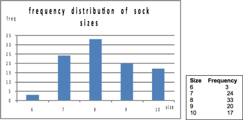
Ann could have created a relative frequency distribution as well as a frequency distribution. The difference is that instead of listing how many times each value occurred, Ann would list what proportion of her sample was made up of socks of each size:
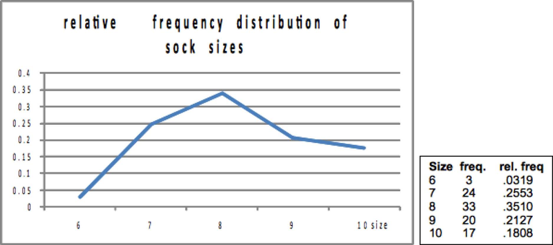
Notice that Ann has drawn the graphs differently. In the first graph, she has used bars for each value, while on the second, she has drawn a point for the relative frequency of each size, and the "connected the dots". While both methods are correct, when you have values that are continuous, you will want to do something more like the "connect the dots" graph. Sock sizes are discrete, they only take on a limited number of values. Other things have continuous values, they can take on an infinite number of values, though we are often in the habit of rounding them off. An example is how much students weigh. While we usually give our weight in whole pounds in the US ("I weigh 156 pounds."), few have a weight that is exactly so many pounds. When you say "I weigh 156", you actually mean that you weigh between 155 1/2 and 156 1/2 pounds. We are heading toward a graph of a distribution of a continuous variable where the relative frequency of any exact value is very small, but the relative frequency of observations between two values is measurable. What we want to do is to get used to the idea that the total area under a "connect the dots" relative frequency graph, from the lowest to the highest possible value is one. Then the part of the area under the graph between two values is the relative frequency of observations with values within that range. The height of the line above any particular value has lost any direct meaning, because it is now the area under the line between two values that is the relative frequency of an observation between those two values occurring.
You can get some idea of how this works if you go back to the bar graph of the distribution of sock sizes, but draw it with relative frequency on the vertical axis. If you arbitrarily decide that each bar has a width of one, then the area "under the curve" between 7.5 and 8.5 is simply the height times the width of the bar for sock size 8: 0.3510 x 1. If you wanted to find the relative frequency of sock sizes between 6.5 and 8.5, you could simply add together the area of the bar for size 7 (that's between 6.5 and 7.5) and the bar for size 8 (between 7.5 and 8.5).
- 2445 reads
