


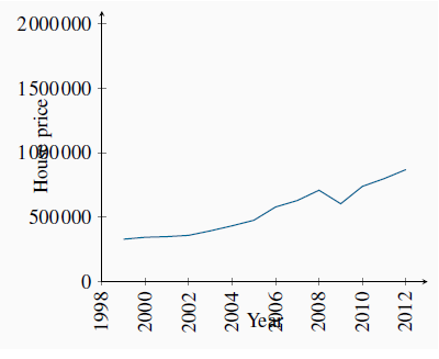
Data come in several forms. One form is time-series, which reflects a set of measurements made in sequence at different points in time. Table 2.1 reports the annual time series values for several price series. Such information may also be presented in charts or graphs. Figure 2.1 plots the data from column 2, and each point represents the data observed for a specific time period. The horizontal axis reflects time in years, the vertical axis price in dollars.
 Time-series: a set of measurements made
sequentially at different points in time.
Time-series: a set of measurements made
sequentially at different points in time.
| 1 | 2 | 3 | 4 | 5 |
| Date | Price of detached bungalows, N. Vancouver | House price index | CPI | Real house price index |
| 1999Q1 | 330,000 | 100.0 | 100.00 | 100.00 |
| 2000Q1 | 345,000 | 104.55 | 101.29 | 103.21 |
| 2001Q1 | 350,000 | 106.06 | 104.63 | 101.37 |
| 2002Q1 | 360,000 | 109.09 | 105.49 | 103.41 |
| 2003Q1 | 395,000 | 119.70 | 108.61 | 110.21 |
| 2004Q1 | 434,000 | 131.52 | 110.01 | 119.55 |
| 2005Q1 | 477,000 | 144.55 | 112.81 | 128.13 |
| 2006Q1 | 580,000 | 175.76 | 114.32 | 153.75 |
| 2007Q1 | 630,000 | 190.91 | 117.33 | 162.71 |
| 2008Q1 | 710,000 | 215.15 | 118.62 | 181.38 |
| 2009Q1 | 605,000 | 183.33 | 120.56 | 152.07 |
| 2010Q1 | 740,000 | 224.24 | 125.40 | 178.96 |
| 2011Q1 | 800,000 | 242.42 | 129.06 | 187.83 |
| 2012Q1 | 870,000 | 263.33 | 131.00 | 210.02 |
Source: Prices for North Vancouver houses come from Royal Le Page; CPI from Statistics Canada, CANSIM II, V41692930 and author’s calculations.
Annual data report one observation per year. We could, alternatively, have presented them in quarterly, monthly, or even weekly form. The frequency we use depends on the purpose: If we are interested in the longer-term trend in house prices, then the annual form suffices. In contrast, financial economists, who study the behaviour of stock prices, might not be content with daily or even hourly prices; they may need prices minute-by-minute. Such data are called high-frequency data, whereas annual data are low-frequency data.
 High (low) frequency data: series with
short (long) intervals between observations.
High (low) frequency data: series with
short (long) intervals between observations.
When data are presented in charts or when using diagrams the scales on the axes have important visual effects. Different scales on either or both axes alter the perception of patterns in the data. To illustrate this, the data from columns 1 and 2 of Table 2.1 are plotted in Figure 2.2 and Figure 2.3, but with a change in the scale of the vertical axis.

The greater apparent slope in Figure 2.2 might easily be interpreted to mean that prices increased more steeply than suggested in Figure 2.3. But a careful reading of the axes reveals that this is not so; using different scales when plotting data or constructing diagrams can mislead the unaware viewer.
- 2373 reads
