


The demand curve is a graphical expression of the relationship between price and quantity demanded, holding other things constant. Figure 3.1 measures price on the vertical axis and quantity on the horizontal axis. The curve D represents the data from the first two columns of Table 3.1. Each combination of price and quantity demanded lies on the curve. In this case the curve is linear— it is a straight line. The demand curve slopes downward (technically we say that its slope is negative), reflecting the fact that buyers wish to purchase more when the price is less.
 The demand curve is a graphical expression of the
relationship between price and quantity demanded, with other influences remaining unchanged.
The demand curve is a graphical expression of the
relationship between price and quantity demanded, with other influences remaining unchanged.
The supply curve is a graphical representation shows the relation between price and quantity supplied, holding other things constant. The supply curve S in Figure 3.1 is based on the data from columns 1 and 3 in Table 3.1. It, too, is linear, but has a positive slope indicating that suppliers wish to supply more at higher prices.
 The supply curve is a graphical expression of the
relationship between price and quantity supplied, with other influences remaining unchanged.
The supply curve is a graphical expression of the
relationship between price and quantity supplied, with other influences remaining unchanged.
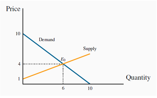
The demand and supply curves intersect at point Eo, corresponding to a price of $4 which, as illustrated above, is the equilibrium price for this market. At any price below this the horizontal distance between the supply and demand curves represents excess demand, because demand exceeds supply. Conversely, at any price above $4 there is an excess supply that is again measured by the horizontal distance between the two curves. Market forces tend to eliminate excess demand and excess supply as we explained above.
- 3946 reads
