


A second basic form of statistical relationship is a correlation between two quantitative variables, where the average score on one variable differs systematically across the levels of the other. Again, a wide variety of research questions in psychology take this form. Is being a happier person associated with being more talkative? Do children’s memories for touch information improve as they get older? Does the effectiveness of psychotherapy depend on how much the patient likes the therapist?
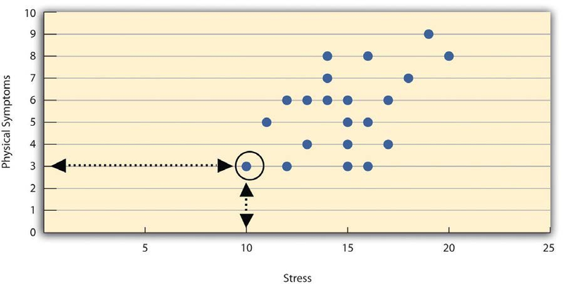
Correlations between quantitative variables are often presented using scatterplots. Figure 2.2 shows some hypothetical data on the relationship between the amount of stress people are under and the number of physical symptoms they have. Each point in the scatterplot represents one person’s score on both variables. For example, the circled point in Figure 2.2 represents a person whose stress score was 10 and who had three physical symptoms. Taking all the points into account, one can see that people under more stress tend to have more physical symptoms. This is a good example of a positive relationship, in which higher scores on one variable tend to be associated with higher scores on the other. A negative relationship is one in which higher scores on one variable tend to be associated with lower scores on the other. There is a negative relationship between stress and immune system functioning, for example, because higher stress is associated with lower immune system functioning.
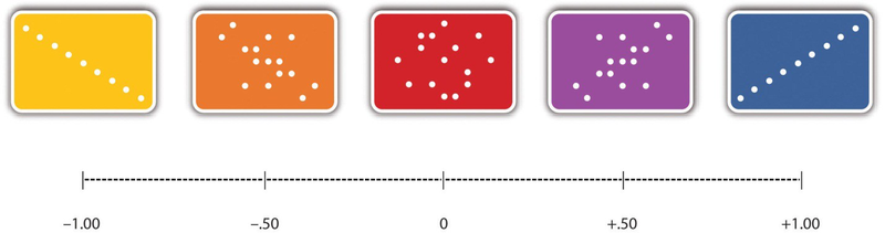
The strength of a correlation between quantitative variables is typically measured using a statistic called Pearson’sr. As Figure 2.3 shows, Pearson’s r ranges from −1.00 (the strongest possible negative relationship) to +1.00 (the strongest possible positive relationship). A value of 0 means there is no relationship between the two variables. When Pearson’s r is 0, the points on a scatterplot form a shapeless “cloud.” As its value moves toward −1.00 or +1.00, the points come closer and closer to falling on a single straight line.
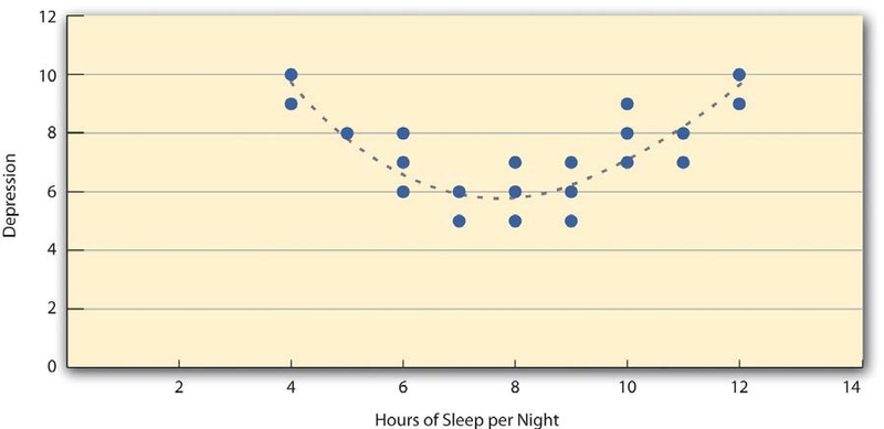
Pearson’s r is a good measure only for linear relationships, in which the points are best approximated by a straight line. It is not a good measure for nonlinear relationships, in which the points are better approximated by a curved line. Figure, for example, shows a hypothetical relationship between the amount of sleep people get per night and their level of depression. In this example, the line that best approximates the points is a curve—a kind of upside-down “U”—because people who get about eight hours of sleep tend to be the least depressed. Those who get too little sleep and those who get too much sleep tend to be more depressed. Nonlinear relationships are fairly common in psychology, but measuring their strength is beyond the scope of this book.
- 2354 reads
