


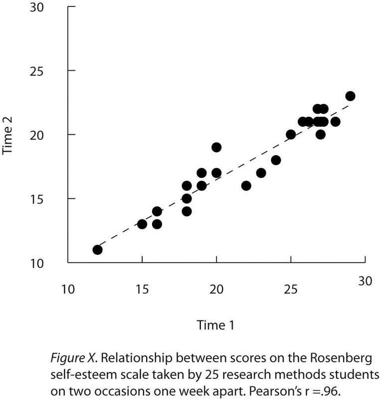
Scatter plots are used to present relationships between quantitative variables when the variable on the x-axis (typically the independent variable) has a large number of levels. Each point in a scatterplot represents an individual rather than the mean for a group of individuals, and there are no lines connecting the points. The graph in Figure 12.13 is an APA-style version of Figure 12.7, which illustrates a few additional points. First, when the variables on the x-axis and y-axis are conceptually similar and measured on the same scale—as here, where they are measures of the same variable on two different occasions—this can be emphasized by making the axes the same length. Second, when two or more individuals fall at exactly the same point on the graph, one way this can be indicated is by offsetting the points slightly along the x-axis. Other ways are by displaying the number of individuals in parentheses next to the point or by making the point larger or darker in proportion to the number of individuals. Finally, the straight line that best fits the points in the scatterplot, which is called the regression line, can also be included.Correlations Between Quantitative Variables
- 1894 reads
